


5 Tips for designing an effective website for Los Angeles-based businesses
There are numerous approaches for an effective website design, ranging from elegant and classic to minimalistic, or from energetic and playful to sleek and contemporary. The possibilities are endless.
Although your website should reflect your personal style, profession, and brand identity, there are certain fundamental principles that always apply and to consider for website design in Los Angeles-based businesses.
Effective and compelling web design enhances the user experience and functionality, and is easy to understand at first glance. Here are five simple website design tips to help you achieve this:
Web design tips for an effective website:
- Introduction headline
- Choose a clean and professional design
- Make the navigation easy to navigate
- Optimize for mobile devices
- Utilize Calls to Action
1. Introduction headline
An introduction headline on a website is the main title or heading at the top of the homepage, or the first page that a visitor sees when they arrive at a website. It is meant to introduce the website to the visitor and provide a brief overview of what the website is about. The introduction headline should be attention-grabbing and concise, and should clearly communicate the purpose and value of the website to the visitor. It should Hook and grab the reader's attention and provide a brief overview of the importance of an effective website for businesses in Los Angeles. It is usually the first thing that a visitor sees when they land on a website, so it is important to make a strong first impression and set the tone for the rest of the website.
The homepage of your website should immediately convey your main message. People tend to quickly scan websites rather than reading every word, so it is important to create a homepage that captures their attention and draws them in. To do this, consider using emotionally impactful images and language rather than a lot of text. Remember that people will be looking for keywords, sentences, and images as they scan the page, so make sure these elements are prominent and clearly communicate your message.
2.Choose a clean and professional design
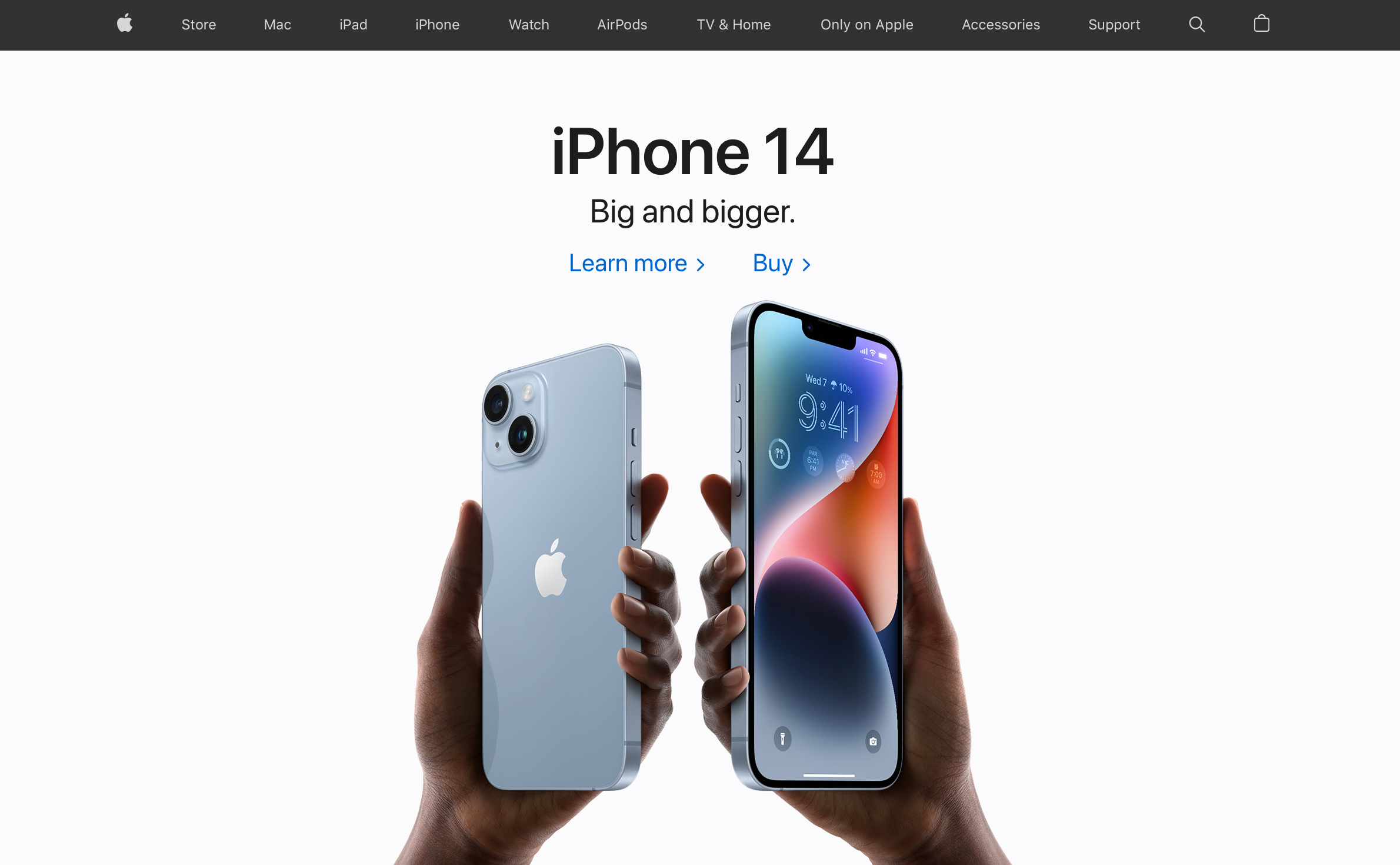
A clean and professional website design is one that is visually appealing, easy to navigate, and free of clutter. It typically uses a simple, minimalistic layout with a limited color palette, clear typography, and plenty of white space. Here is an example of a website with a clean and professional design:
- Apple's website (https://www.apple.com/) is a good example of a clean and professional website design. The homepage features a simple layout with large, high-quality images and minimal text. The navigation menu is clear and easy to use, and the overall design is consistent with the company's brand identity.
Other characteristics of a clean and professional website design might include:
- A responsive design that looks good on all devices
- Fast loading times
- Easy-to-use forms and other interactive elements
- Consistent branding throughout the website
- A clear hierarchy of information, with the most important content given prominence
- A clear call to action that guides the visitor towards the next step they should take on the website.
3. Make the navigation easy to navigate
Although it may be tempting to be innovative with your website navigation, it is important to remember that the primary goal is to make it easy for users to find what they are looking for. A clear and straightforward navigation system also helps search engines index your content and enhances the overall user experience.
There are several factors that contribute to easy navigation on a website:
- A clear and intuitive menu: The navigation menu should be prominently displayed and easy to find. It should also be organized in a logical way, with categories and subcategories that make sense to the visitor.
- Descriptive and accurate link labels: The labels on the menu should clearly describe the content that can be found on the linked pages. Avoid using vague or misleading labels, as this can lead to confusion and frustration for the visitor.
- Search function: A search function can be very helpful for visitors who are looking for specific information on your website. Make sure the search function is easy to find and use.
- Breadcrumb trails: Breadcrumb trails show the visitor's location within the site hierarchy and allow them to easily navigate back to higher-level pages.
- Linking to related content: Consider adding links to related content within your pages to help visitors find additional information that may be of interest to them.
- Mobile-friendliness: In today's world, it is essential for a website to be mobile-friendly. Make sure your navigation works well on mobile devices as well as desktop computers.
4. Optimize for mobile devices
Optimizing your website for mobile devices is important because the number of people accessing the internet from mobile devices has significantly increased in recent years. According to Statista, over half of all internet traffic worldwide was generated through mobile devices in 2021. This trend is likely to continue in the future, so it is essential to ensure that your website is accessible and easy to use on mobile devices.
To ensure that all visitors can fully experience your professional website, it is important to optimize it for all devices. When designing a website, BRADIENT includes mobile optimization in the design and development process to ensure that the website is accessible and user-friendly on all devices.
Here are a few ways to optimize your website for mobile devices:
- Improved user experience: A website that is optimized for mobile devices is easier to navigate and use on a small screen, which can improve the overall user experience for mobile visitors.
- Better search engine rankings: Google and other search engines prioritize mobile-friendly websites in their search results. By optimizing your website for mobile devices, you can improve your search engine rankings and increase the visibility of your website to potential customers.
- Increased conversions: A mobile-friendly website is more likely to convert visitors into customers because it provides a good user experience and makes it easier for people to take action (such as filling out a form or making a purchase).
In summary, optimizing your website for mobile devices is important because it can improve the user experience, increase your search engine rankings, and lead to more conversions.
5. Utilize Calls to Action
Calls to action (CTAs) are buttons or links that encourage visitors to take a specific action on your website, such as filling out a form, making a purchase, or subscribing to a newsletter. Here are a few effective ways to utilize calls to action on your website:
- Make them prominent: CTAs should be easy to find and stand out from the rest of the content on the page. Consider using a contrasting color or a large, attention-grabbing button to draw the visitor's eye to the CTA.
- Use actionable language: The language you use in your CTAs should be clear and specific, and should encourage the visitor to take immediate action. Avoid vague or passive language, and use words like "click here," "sign up," or "buy now" to create a sense of urgency.
- Placement matters: The location of your CTAs can have a big impact on their effectiveness. Consider placing them above the fold (the part of the page that is visible without scrolling) or near the end of a blog post or sales page to maximize their impact.
- Test different variations: A/B testing allows you to compare the performance of different versions of your CTAs to see which one is most effective. Try testing different colors, shapes, sizes, and language to see which combination works best for your website.
By following these best practices, you can effectively utilize calls to action on your website to encourage visitors to take the desired action.
Let our expertise guide you to success
Fill out the form below and we will contact you shortly.
