


Solid Drop Shadow using Tailwind CSS
In this post, we will explore how to add a custom solid drop shadow value using Tailwind CSS. Currently, there is no Drop Shadow option available on the list of utilities for applying drop-shadow filters to an element, as mentioned in their documentation here.
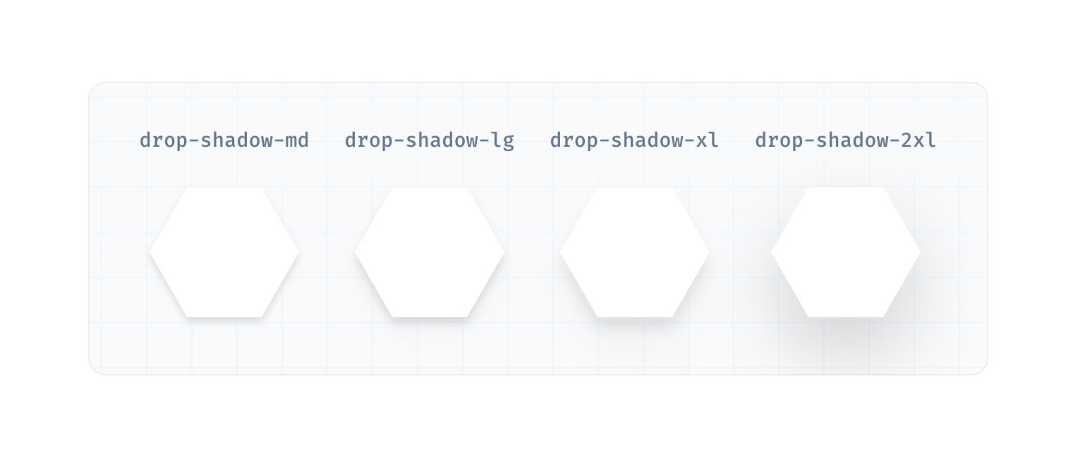
The only options are as shown in this screenshot:
Let's assume you're working on a web design project, and the design is asking for a solid drop shadow without opacity – just a plain box with an offset drop shadow, as shown in the following example:
The method to create a solid drop shadow using Tailwind CSS will be as followed.
Step 1. Add the following to your tailwind.config.js file
/** @type {import('tailwindcss').Config} */
module.exports = {
  content: [
    "./src/pages/**/*.{js,jsx,ts,tsx}",
    "./src/components/**/*.{js,jsx,ts,tsx}",
  ],
  theme: {
    extend: {
      boxShadow: {
        'solid': '20px 20px 0 0 rgb(0 0 0)',
      }
    },
  },
  plugins: [],
}
Step 2. You can use the new solid drop shadow in your className as followed:
<div className="shadow-solid">Hello</div>Step 3. Let's also assume that you want the new solid-shadow to show on the hover state of the div and add a smooth animation. You can achieve this by doing the following:
<div className="hover:shadow-solid transition-shadow">Hello</div>Start a conversation with us now
Fill out the form below and we will contact you shortly.
